Cart Lifecycle Management
Translating a physical warehouse workflow into a coordinated digital system for operations teams.
- Year
- 2026
- Duration
- 3 Months
- Role
- UI/UX Designer & UI Developer
- Client
- Confidential — B2B Warehouse Automation
~6 min read
01 — Overview
Overview
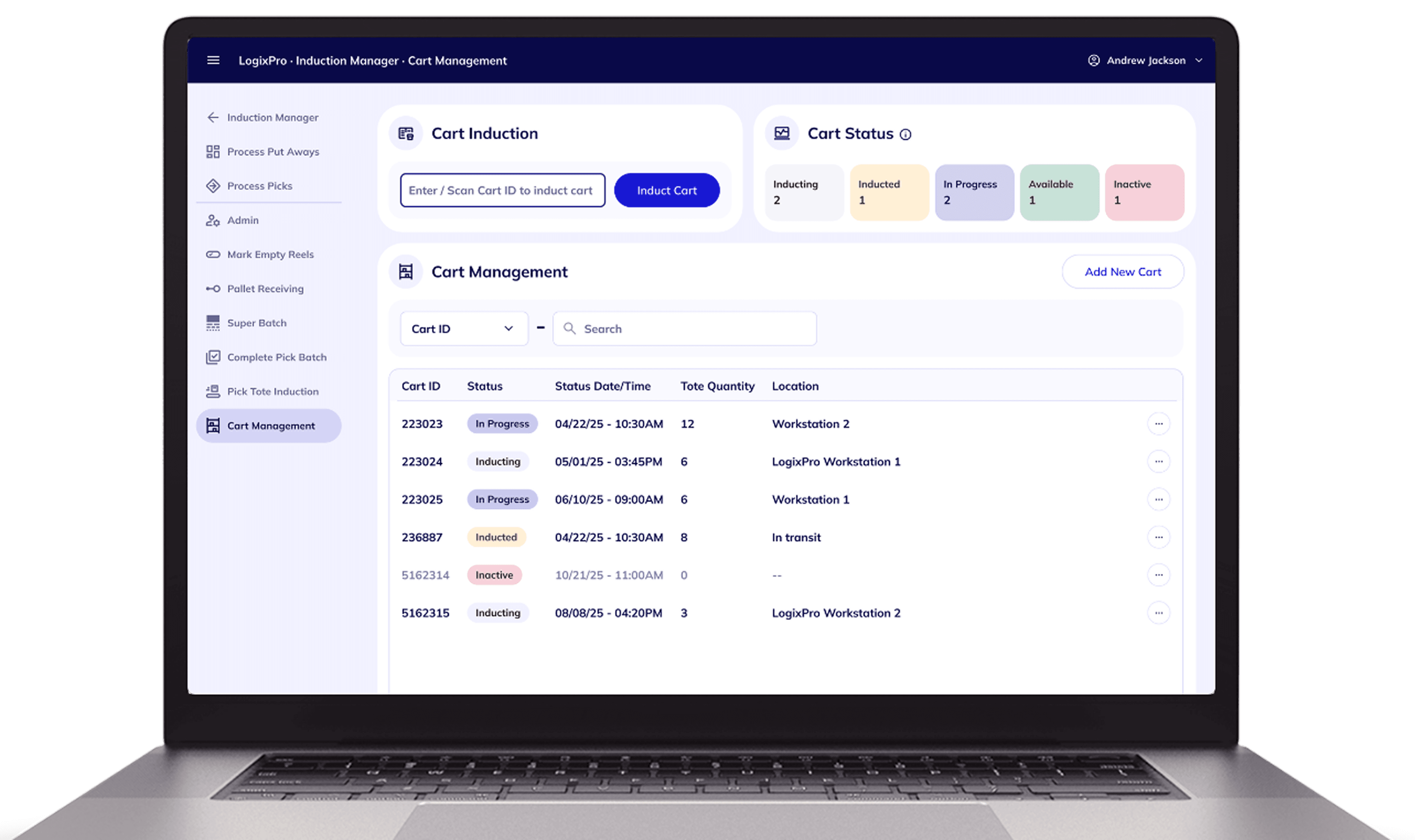
I led the design of the Cart Lifecycle Module — a core component of a B2B warehouse automation platform used by operations teams to manage cart movement from induction to completion. The module enables users to track cart states, configure tote layouts, and coordinate actions across both admin and workstation interfaces. My focus was on structuring complex workflows, reducing operational friction, and ensuring reliable state transitions in real-time environments.
02 — Problem
Problem
When I joined the project, the documentation described the physical flow from induction to picking and completion. What it lacked was any definition of how this should work digitally. There was no clear answer to: how carts move through states in the system, which users control which actions, or how the system handles edge cases like incomplete carts or hardware failures. Without resolving these, building a reliable real-time system wasn't possible.
Most iterations were driven not by visual refinement — but by clarifying operational behavior and failure handling.
Problem statement
The team had a document describing how carts move physically through a warehouse — but no digital interaction model to match it.
03 — My Role
My Role
Led UX design and contributed to UI development for the Cart Lifecycle Module, working across Admin and Workstation interfaces with geographically distributed stakeholders.
- Led UX design of the Cart Lifecycle Module — a core component of the warehouse automation platform
- Structured workflows and defined state transitions across Admin and Workstation interfaces
- Defined system behavior, validation logic, and edge-case handling
- Contributed to UI implementation alongside the development team
04 — Constraints
Constraints
- Geographically separated from client and warehouse operations
- No direct access to physical hardware or end users
- Fixed installation timeline with no buffer
- Strict adherence to an existing design system
05 — Solution
Solution
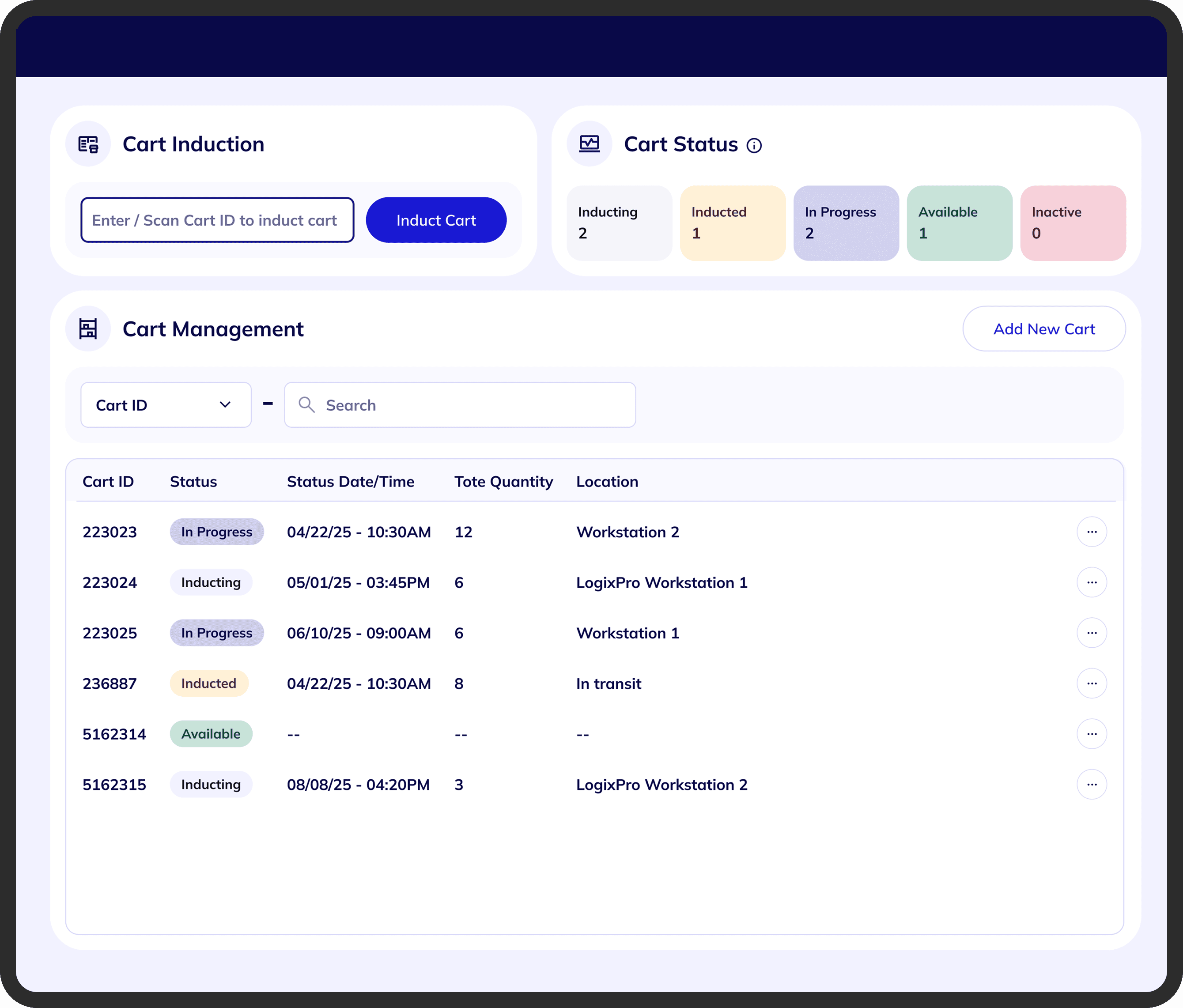
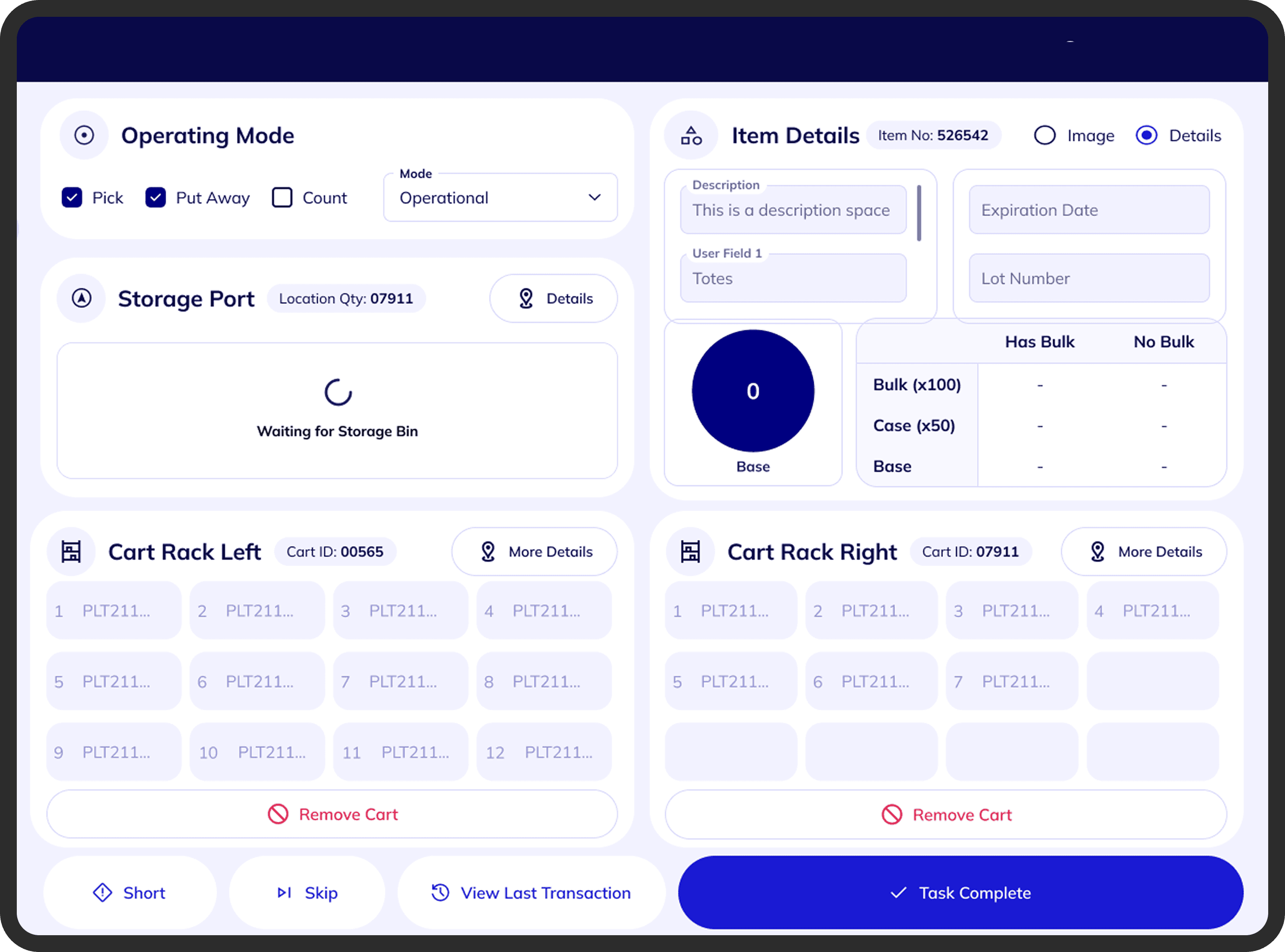
The first major design decision was structural. Instead of placing all actions inside one interface, I separated responsibilities across two coordinated surfaces — aligning each with real operational roles while keeping the cart lifecycle consistent across both. The Admin Interface handles cart induction, editing, deletion, tote configuration, and lifecycle visibility. The Workstation Interface handles real-time picking, tote fulfillment, cart completion, and recovery.
06 — Process
Process
Each decision was grounded in the constraints of real-time warehouse operations — where errors are costly and operators need clarity above all else.
Defining the Cart Lifecycle
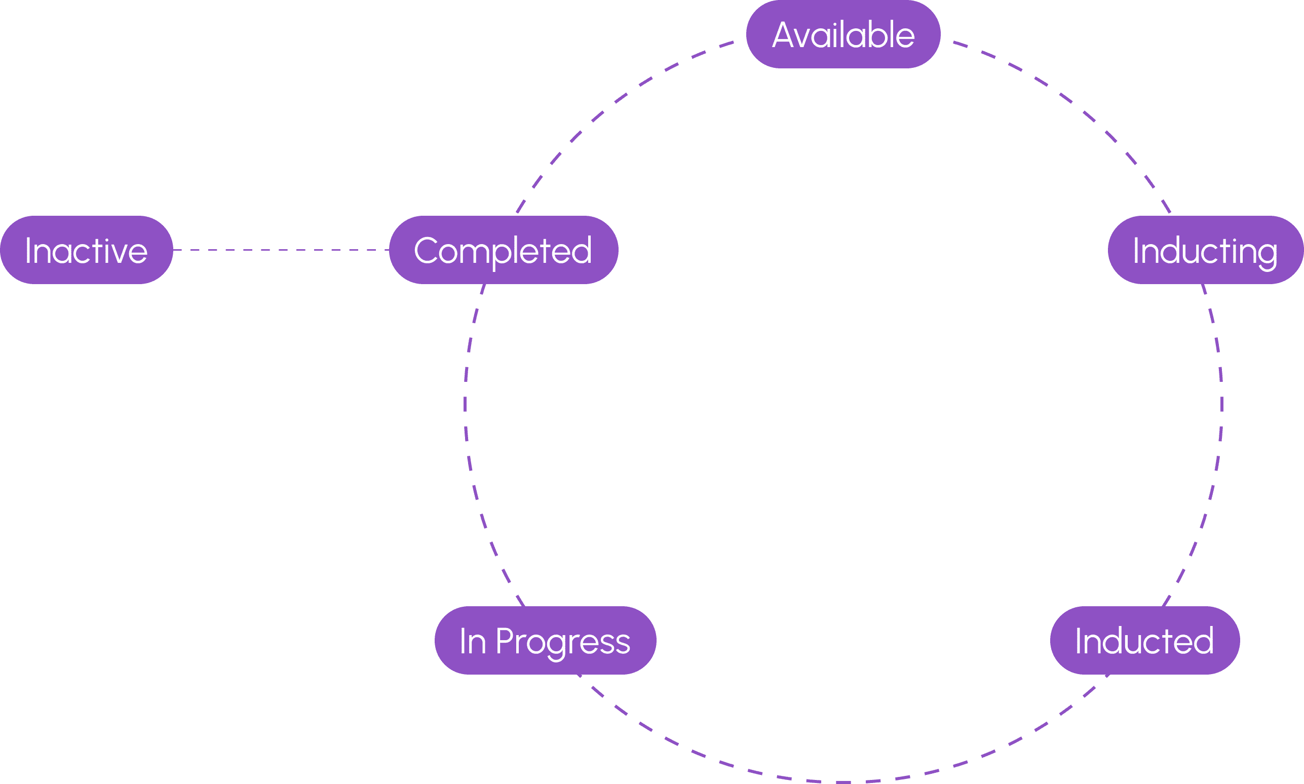
Before any UI could be designed, the system needed a shared language. I mapped the physical workflow into six discrete digital states: Available → Inducting → Inducted → In Progress → Completed → Inactive, with a specific rule that only Completed carts can transition to Inactive. This state model became the foundation for all logic, validation, and interface behavior across both interfaces.
Rethinking Cart Induction
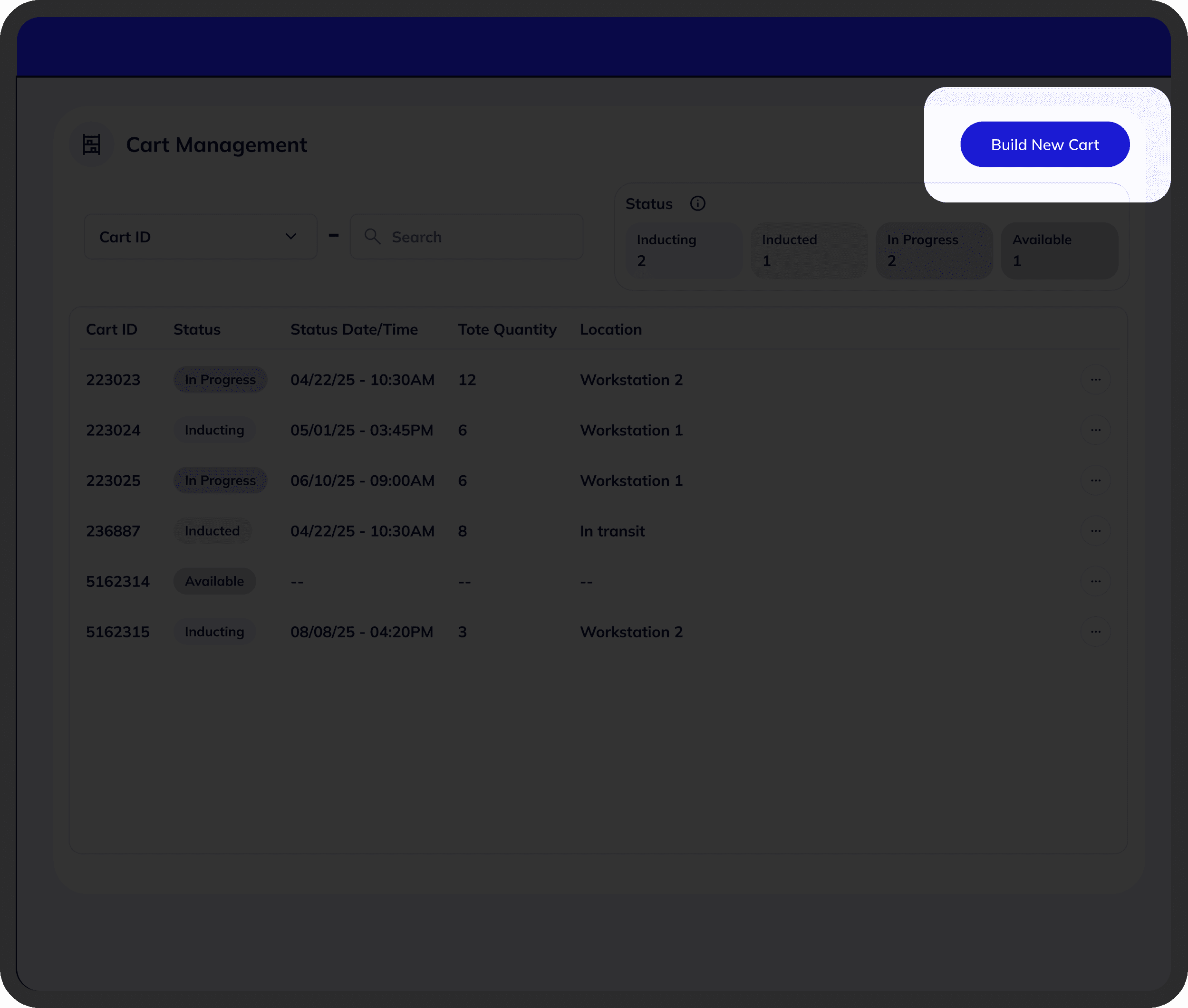
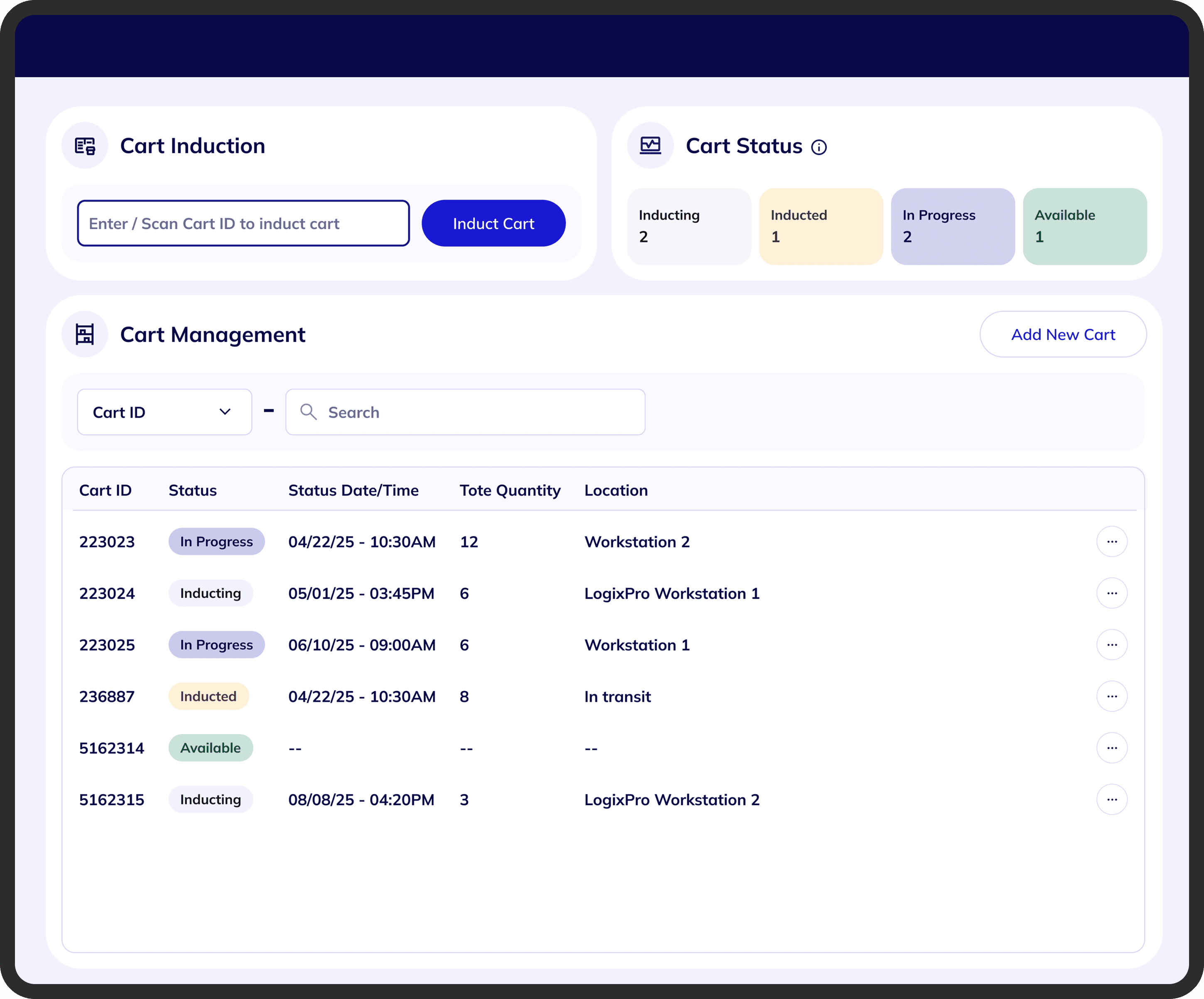
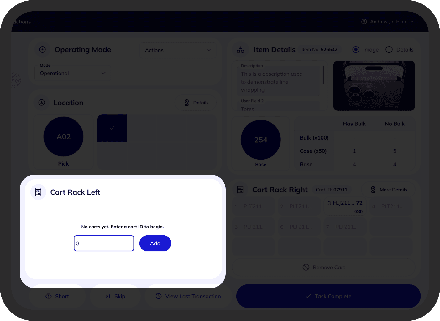
The first design used a modal-based "Build New Cart" flow. While technically correct, the button created unnecessary friction — induction was the most frequent task operators performed. Through client discussions and workflow reviews, we redesigned it: cart scanning became the first visible action, with the scan field auto-focused when the screen loaded. This turned induction into a scan-first workflow, matching how operators actually work.
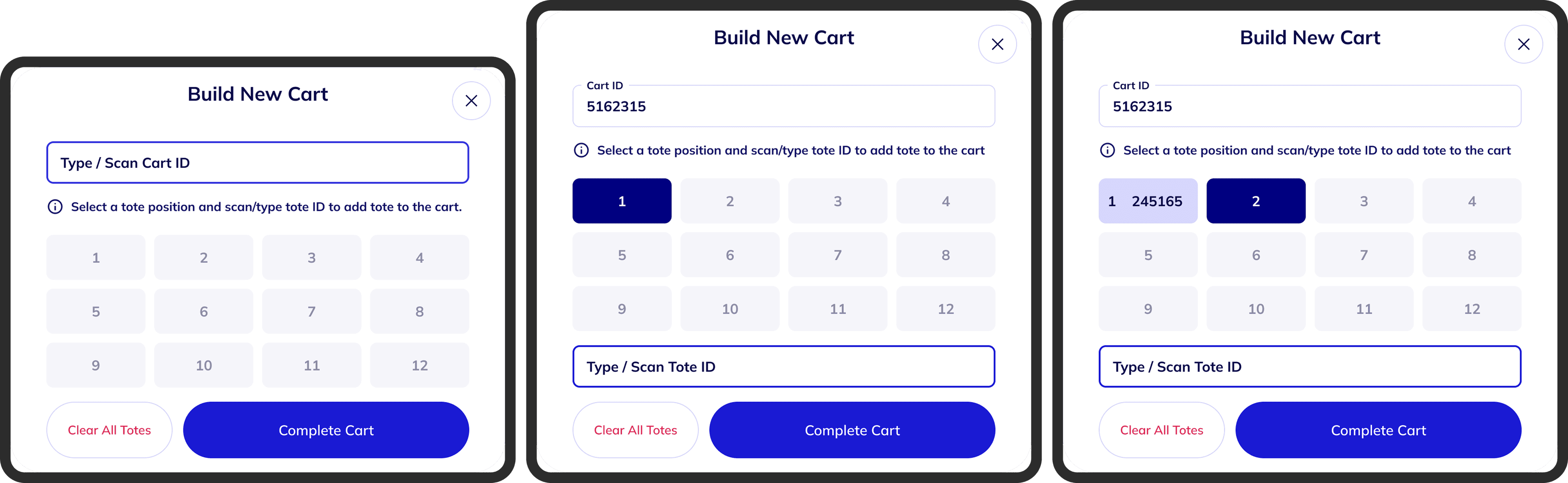
Handling Dynamic Cart Layouts
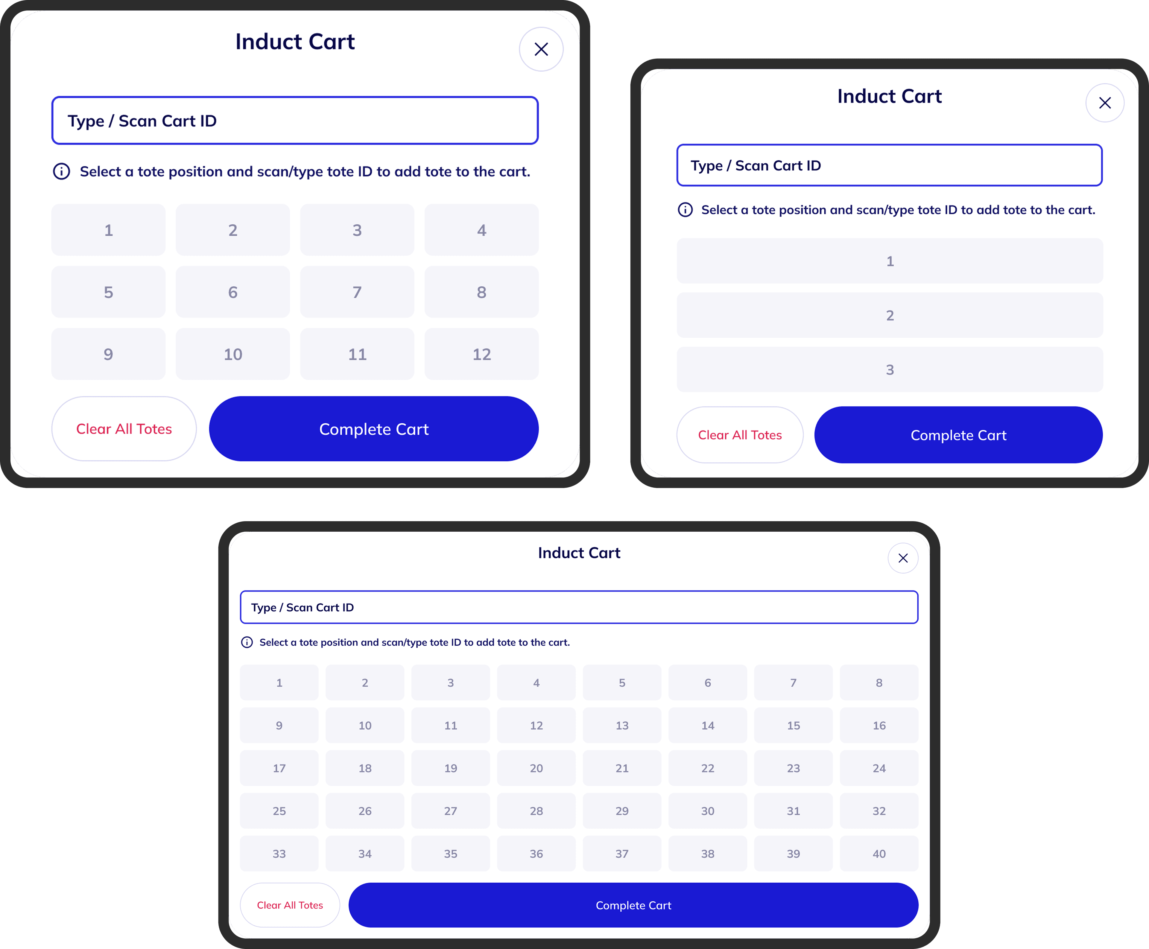
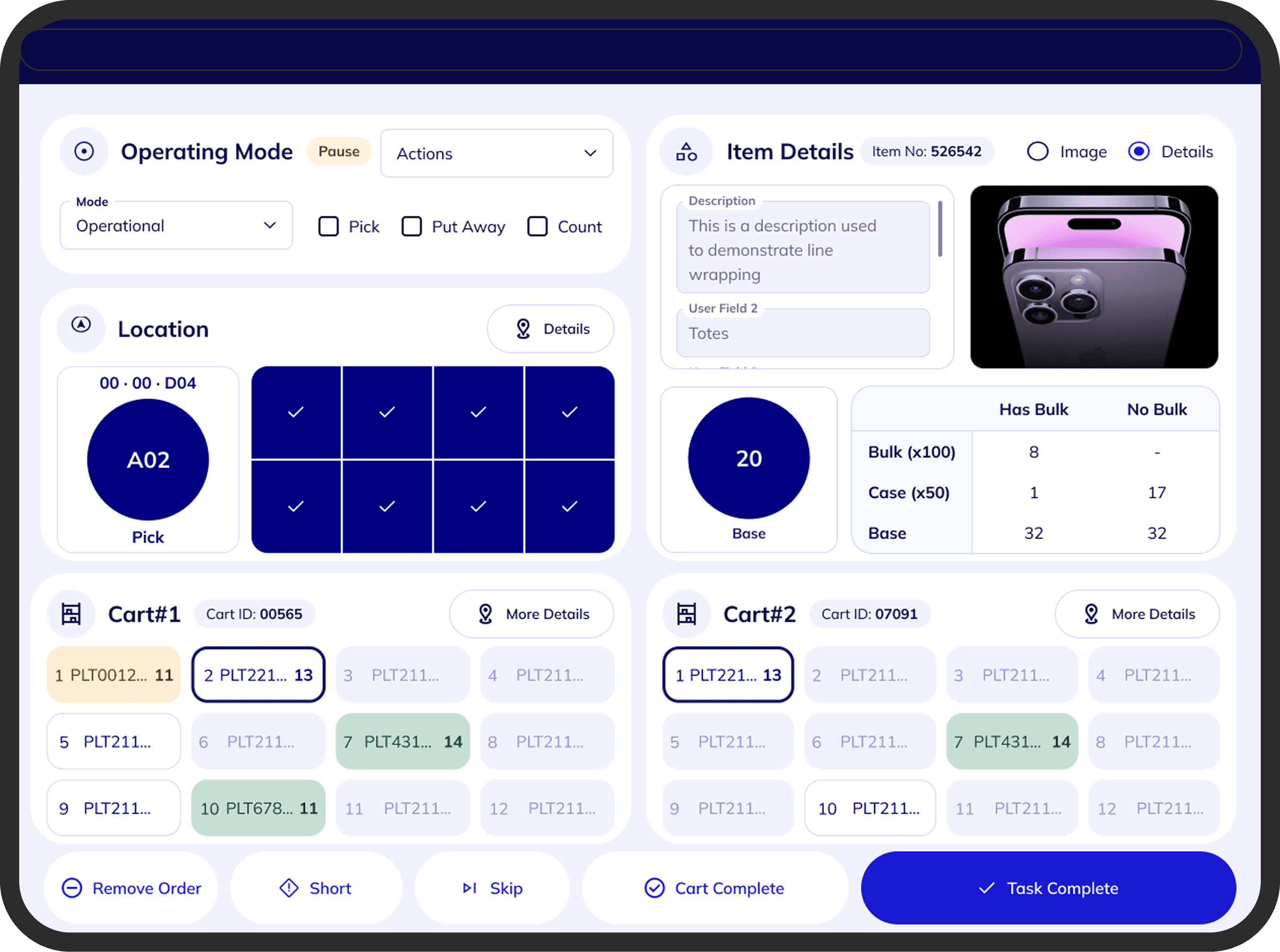
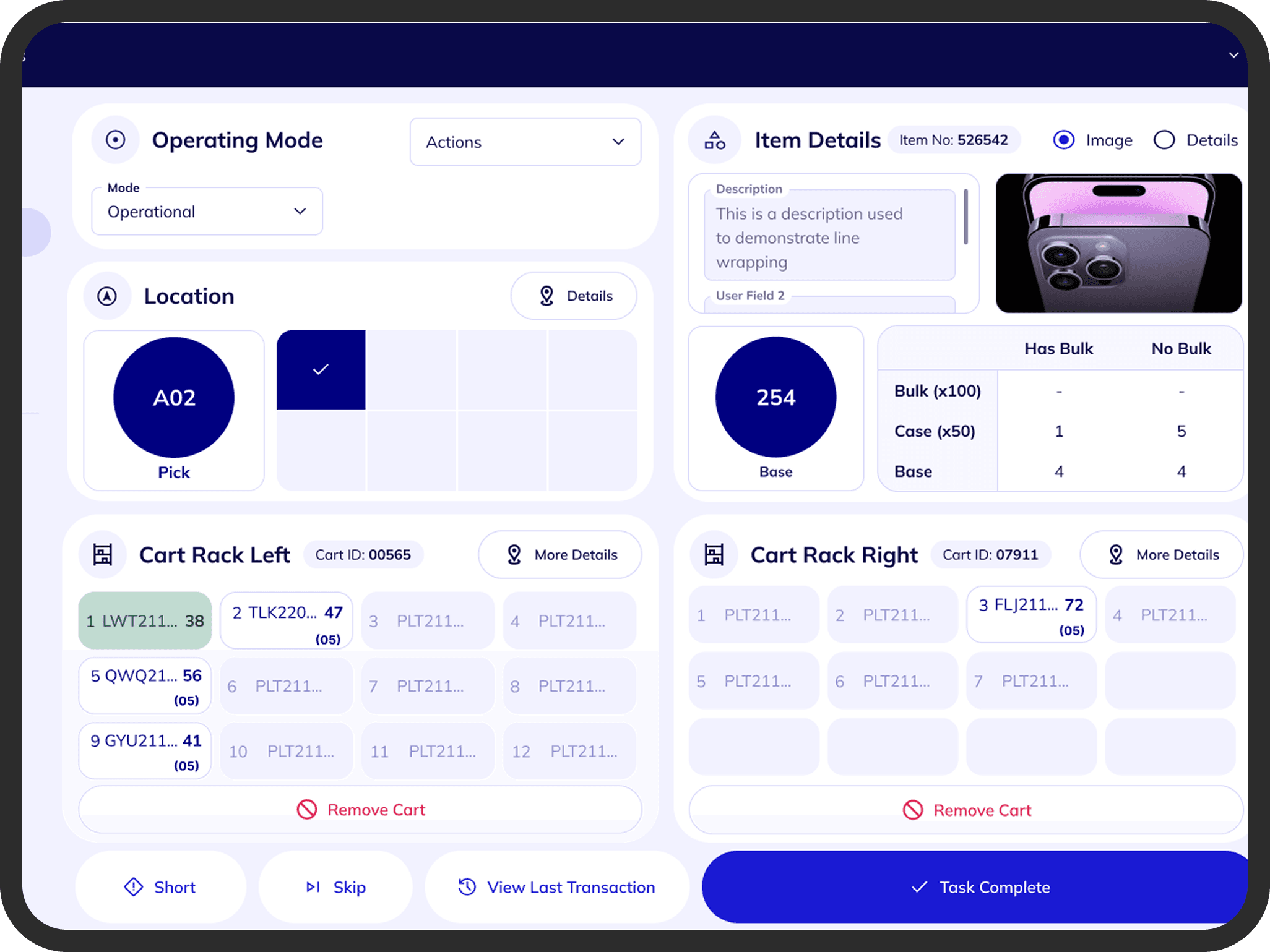
Carts in the warehouse are not uniform — different carts have different numbers of shelves and tote positions. A fixed UI grid wouldn't hold up in practice. We implemented dynamic tote grids generated from backend configuration, with a maximum of 8 columns × 5 rows. Each cart's layout mirrored its physical structure so operators could instantly map the screen to the real cart in front of them.
Preventing Configuration Errors
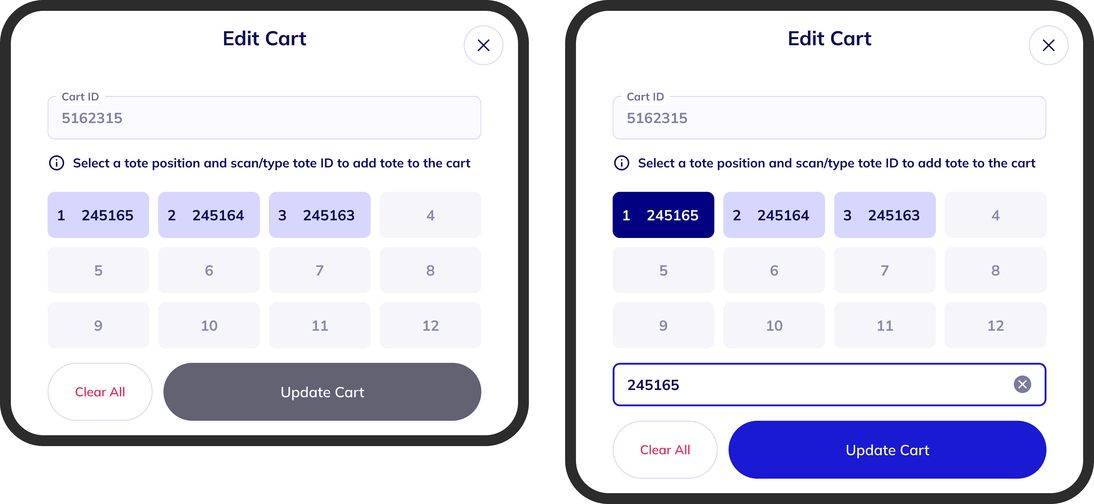
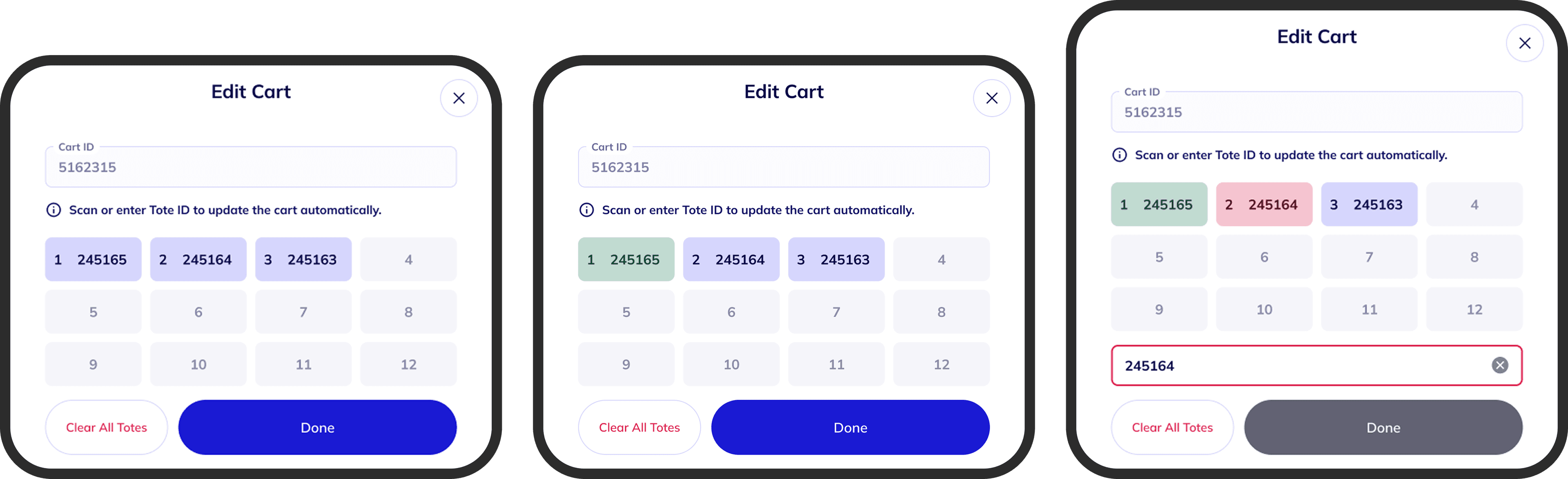
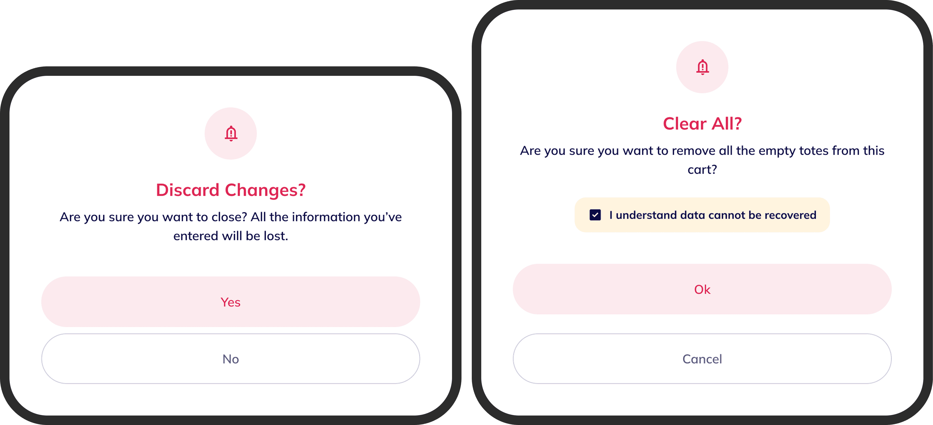
The initial Edit Cart experience allowed free modification with minimal system feedback. This introduced risk — incorrect configurations during induction could propagate downstream into picking operations. The interface lacked validation for invalid cart IDs, no indication of incorrect tote entries, and no restrictions on editing already-processed totes. We introduced inline safeguards: visual indicators for valid and invalid entries, and confirmation dialogs before clearing configurations.
Clarifying Completion Logic
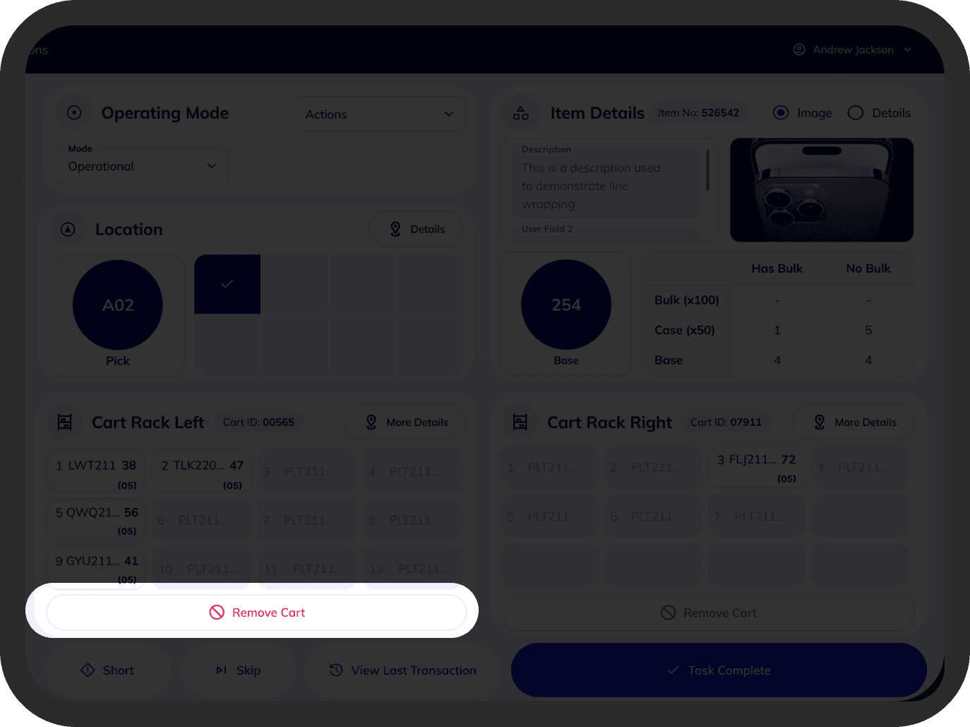
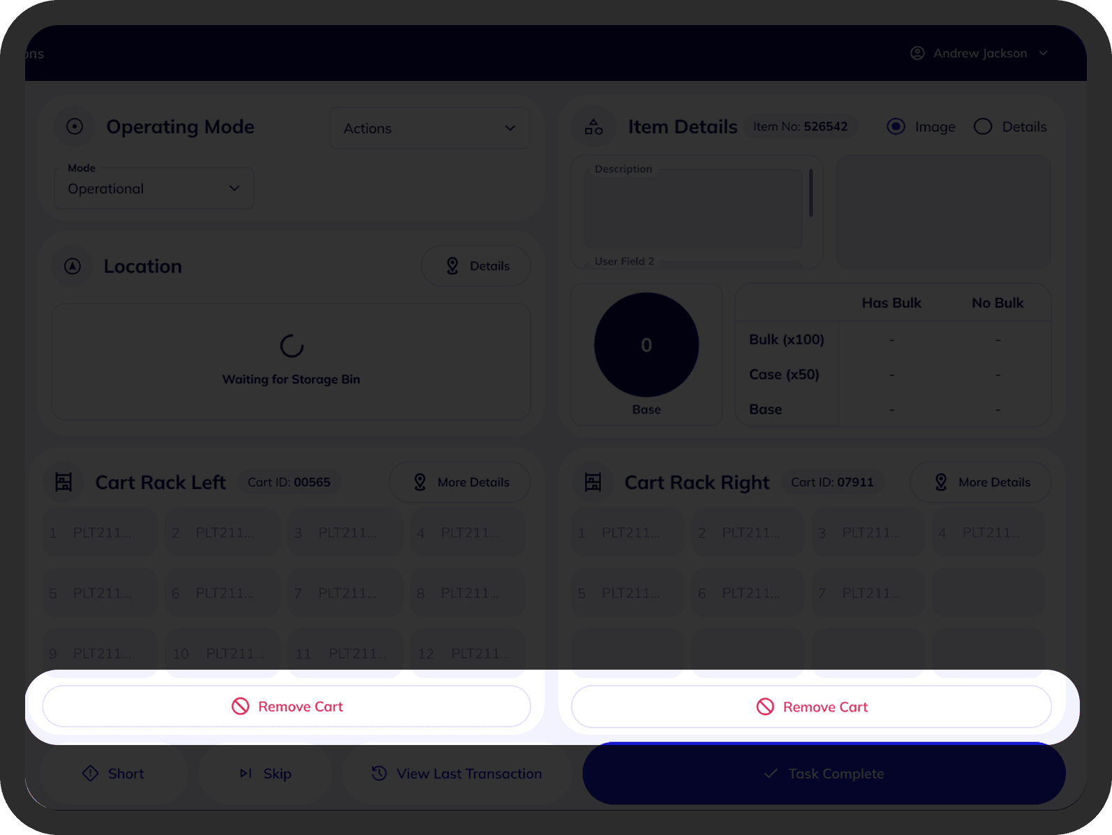
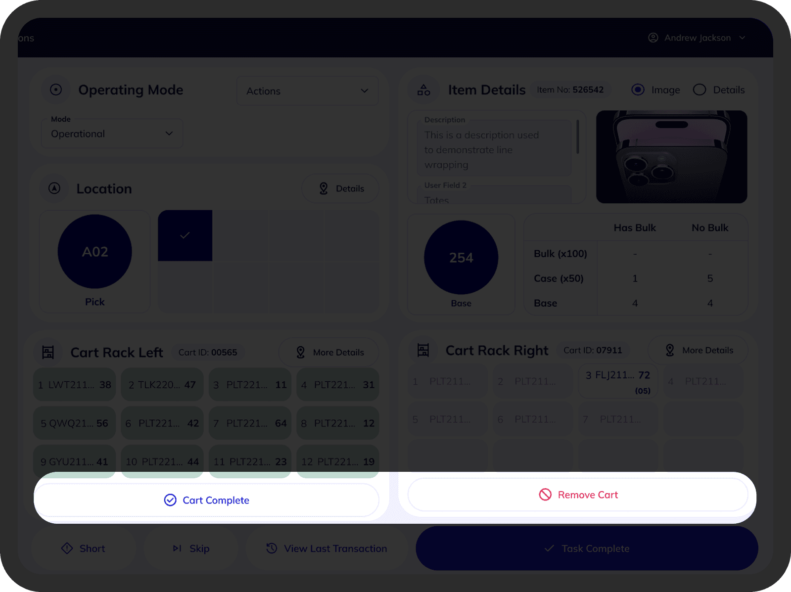
We initially explored automatic completion once all totes were filled. But operational discussions revealed that automation could create ambiguity during real warehouse runs — carts could be marked done before operators were ready, causing downstream errors that were expensive to reverse. We retained explicit controls: Remove Cart for emergency early removal (e.g. hardware failure), and Complete Cart for final confirmation. In high-stakes environments, control beats convenience.
Simplifying Visual States
Early designs relied on multiple color states to signal tote status. While visually expressive, it created confusion and conflicted with the design system. We simplified the hierarchy: subtle emphasis for active totes, green for completed totes, muted styling for inactive positions. One color, one meaning — this reduced cognitive load during high-speed picking.
07 — Key Decisions
Key Decisions
These are the moments where I had to weigh competing options, navigate constraints, and commit to a direction. They shaped the final experience more than any single screen.
Decision 01
How should cart induction begin?
Options considered
- Modal-based 'Build New Cart' flow — operator initiates setup before scanning
- Scan-first workflow — scanning is the first and only action on screen load
What I chose
Scan-first workflow
Rationale
Cart induction is the highest-frequency task on the warehouse floor. A modal flow required deliberate setup before any action could occur. Shifting to scan-first eliminated that friction — the scan field is auto-focused on load, keeping operators in motion and matching the physical habit of scanning barcodes they already had.
Decision 02
Should cart layout be fixed or dynamically configurable?
Options considered
- Fixed grid layout — simpler to build, visually consistent
- Dynamic tote grid — generated from backend config, up to 8 × 5 per cart
What I chose
Dynamic tote grid
Rationale
Carts in the warehouse varied significantly in physical structure. A fixed grid would have forced operators to mentally reconcile mismatches between the screen and the actual cart in front of them. The interface needed to adapt to hardware reality, not the other way around.
Decision 03
Should cart completion be automated or operator-controlled?
Options considered
- Automated — system marks cart done when all totes are filled
- Explicit controls — completion and removal require deliberate operator action
What I chose
Explicit operator controls
Rationale
Automation introduced real operational risk: a cart auto-completing while an operator wasn't ready could trigger downstream errors that were expensive to reverse. In a warehouse environment, the cost of a wrong completion is high. Giving operators deliberate control — Complete Cart and Remove Cart — was more trustworthy and aligned with how they think about their own workflow.
08 — Outcome
Outcome
The Cart Lifecycle Module was successfully deployed within the client's installation timeline. The system delivered centralized lifecycle visibility across two interfaces, faster induction through a scan-first workflow, clearer real-time picking states through a simplified visual hierarchy, and safer completion and recovery handling with explicit operator controls.
Reflection
Many of the most important design decisions were not about layout — they were about defining how the system behaves under real operational conditions. In high-stakes warehouse environments, clarity and explicit control consistently outperform automation. The best interactions were the ones operators didn't have to think about — not because the system decided for them, but because the interface made the right action obvious.