Landing Page Design
Structuring Complex Information for Clarity and Readability
- Year
- 2026
- Duration
- 2 weeks
- Role
- UI/UX Designer
- Client
- Potential Clients — Food & Nutraceutical Industry
~5 min read
01 — Overview
Overview
This project involved designing a landing page for a warehouse automation platform serving the Food & Nutraceutical industry, aimed at communicating product value to potential clients and leadership. The challenge wasn't visual design. It was making a content-heavy page readable, structured, and easy to navigate.

02 — Problem
Problem
Early versions struggled with dense information blocks, low scannability, and visual noise that distracted from key messages. The core issue was that users had to work too hard to understand the content.
Users had to work too hard to understand the content
Problem statement
The landing page needed to explain a complex product, communicate value clearly to decision-makers in the Food & Nutraceutical space, and handle large amounts of content without overwhelming users.
03 — My Role
My Role
Led the design of the landing page, focusing on structure, hierarchy, and readability for a content-heavy B2B product.
- Designed the landing page structure and layout
- Iterated on content organization and visual hierarchy
- Ensured readability and scannability for complex information
- Focused on removing friction rather than adding visual elements
04 — Constraints
Constraints
- Audience: leadership teams and potential clients in Food & Nutraceutical manufacturing
- Content was fixed and inherently complex
- Multiple sections required detailed explanations
- Critical sections like process and results needed to remain information-rich
05 — Solution
Solution
The solution focused on structure, hierarchy, and readability rather than reducing content. Through three iterations, the design evolved from content-first to clarity-first, removing unnecessary elements and strengthening structure.



06 — Process
Process
Each decision was grounded in the constraints of real-time warehouse operations — where errors are costly and operators need clarity above all else.
Version 1 — Content First, Structure Later
The first version focused on placing all required content. Issues included heavy text blocks, weak visual hierarchy, difficult to scan, and important sections didn't stand out. At this stage, the page felt more like a document than a landing experience.
Version 2 — Introducing Visual Elements
To improve clarity, visual elements like icons and structured cards were introduced. This improved separation of sections and slightly improved readability, but icons made the interface feel dated and added noise instead of clarity. Key insight: More visuals do not automatically improve understanding.
Version 3 — Simplifying for Clarity (Final)
The final direction focused on removing unnecessary elements and strengthening structure. Key decisions included removing icons to reduce visual noise, simplifying layouts across sections, improving spacing and alignment, strengthening typography hierarchy, and making sections easier to scan. The focus shifted from adding clarity to removing friction.
07 — Key Decisions
Key Decisions
These are the moments where I had to weigh competing options, navigate constraints, and commit to a direction. They shaped the final experience more than any single screen.
Decision 01
How to make critical sections readable?
Options considered
- Keep content as is with minimal changes
- Break content into structured chunks, use clear grouping, introduce spacing, highlight key points
What I chose
Break content into structured chunks, use clear grouping, introduce spacing, highlight key points
Rationale
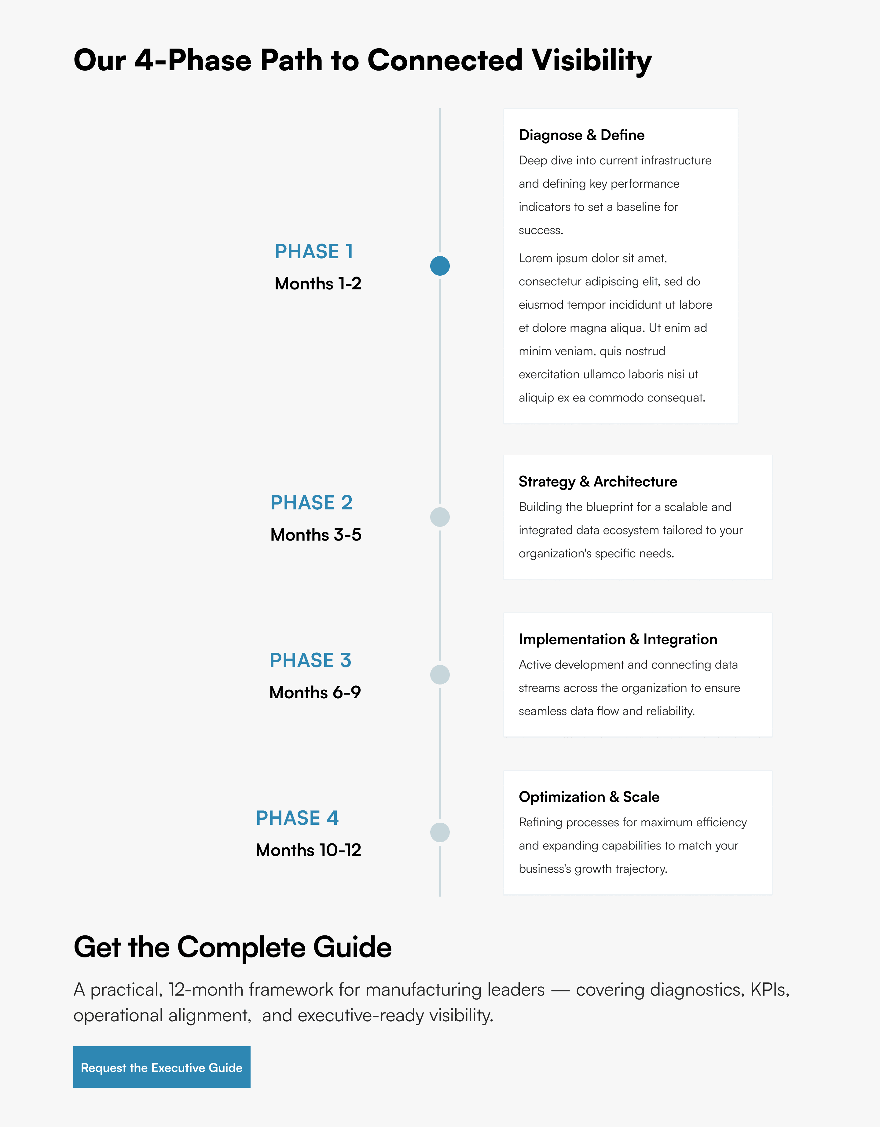
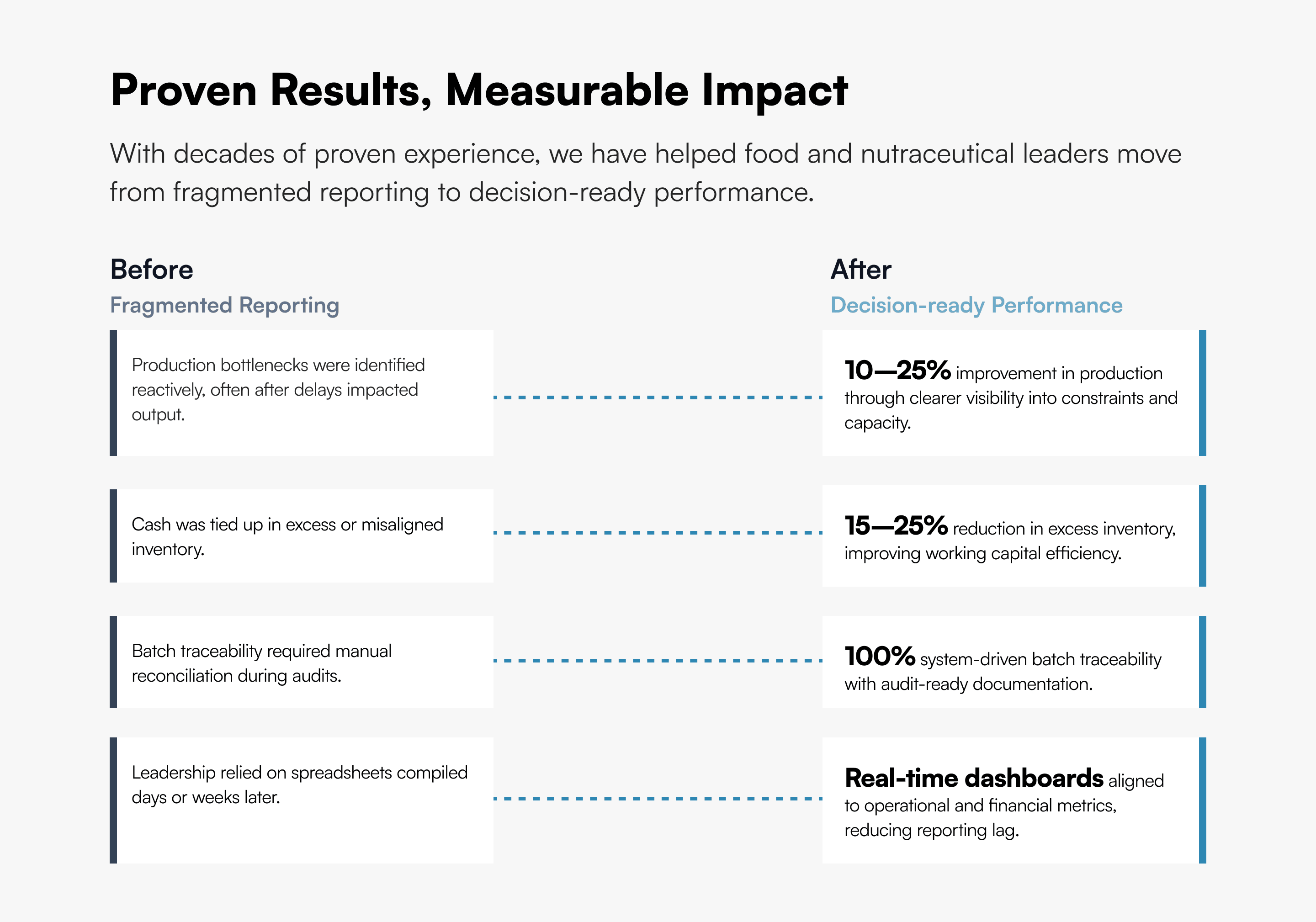
Two sections were especially important: 4-Phase Process and Proven Results and Measurable Impact. These were central for stakeholders evaluating operational value. The design approach broke content into structured chunks, used clear grouping to guide reading, introduced spacing to reduce cognitive load, and highlighted key points without overwhelming users.
Decision 02
How to improve content hierarchy?
Options considered
- Maintain existing hierarchy
- Make headings more prominent, space and simplify supporting text, clearly separate sections
What I chose
Make headings more prominent, space and simplify supporting text, clearly separate sections
Rationale
Across the page, headings were made more prominent, supporting text was spaced and simplified, and sections were clearly separated. This allowed users to scan quickly, focus on relevant sections, and understand value without reading everything.
Decision 03
How to reduce visual noise?
Options considered
- Add more visual elements for clarity
- Remove anything that does not directly support understanding, let layout, spacing, and typography drive clarity
What I chose
Remove anything that does not directly support understanding, let layout, spacing, and typography drive clarity
Rationale
Earlier versions relied on icons and additional UI elements. The final direction removed anything that does not directly support understanding, letting layout, spacing, and typography drive clarity.
08 — Outcome
Outcome
The final landing page presents complex information clearly for Food & Nutraceutical stakeholders, improves readability without reducing necessary content, guides users through the page logically, and highlights key decision-making sections effectively.

Reflection
This project reinforced an important principle: Clarity comes from removing what is unnecessary. In content-heavy B2B products, structure matters more than visuals, hierarchy matters more than decoration, and readability should always come before aesthetics.