Right-Click Filter Indication
Making a hidden interaction visible in a data-heavy system.
- Year
- —
- Duration
- —
- Role
- —
- Client
- Confidential — B2B Warehouse Platform
~5 min read
01 — Overview
Overview
This project focused on improving the discoverability and usability of a right-click filter feature in a B2B warehouse platform. The functionality already existed — but users were either unaware of it, or couldn't interpret results once filters were applied.
The goal wasn't to redesign the system. It was to surface what was already there and make it legible.
02 — Problem
Problem
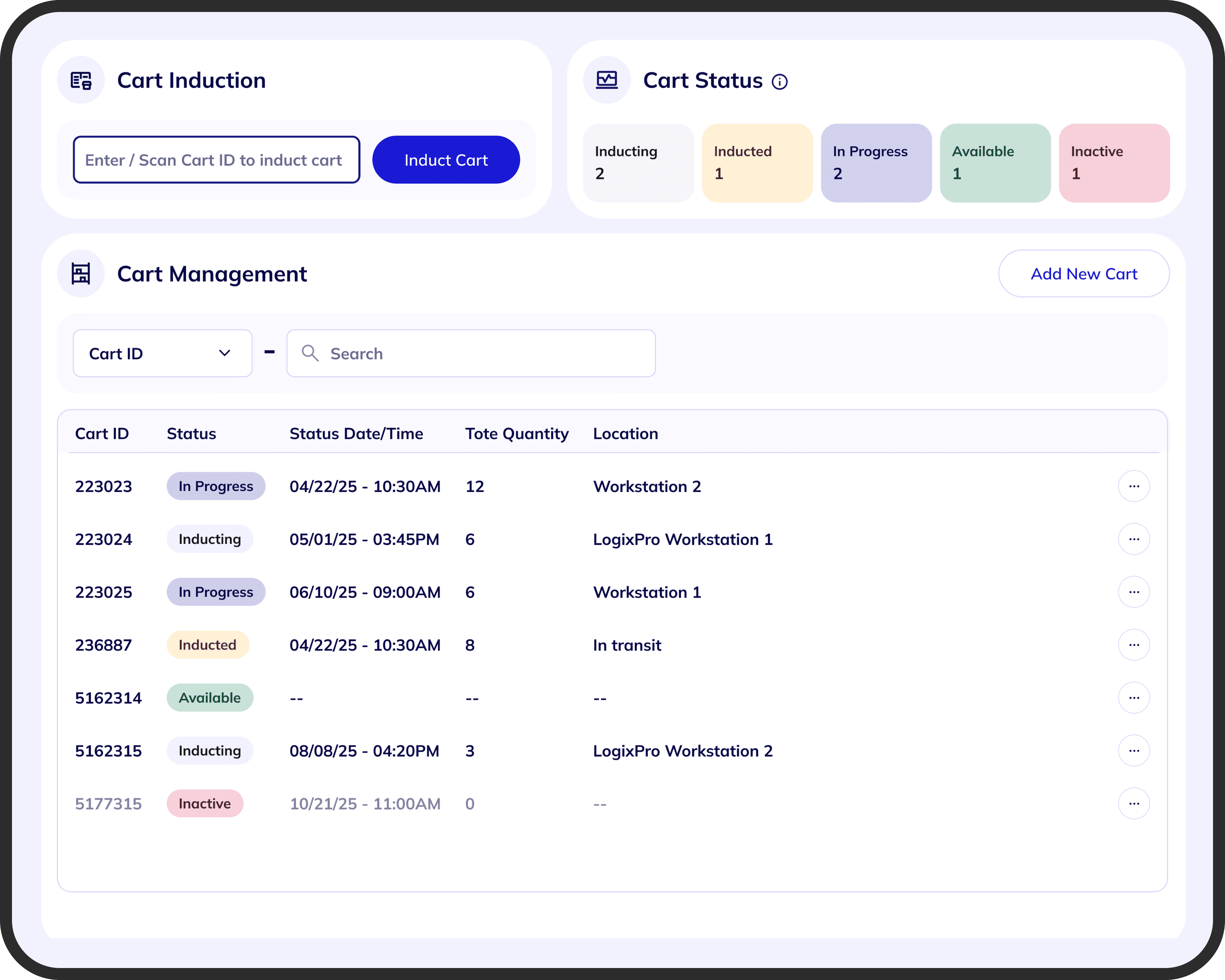
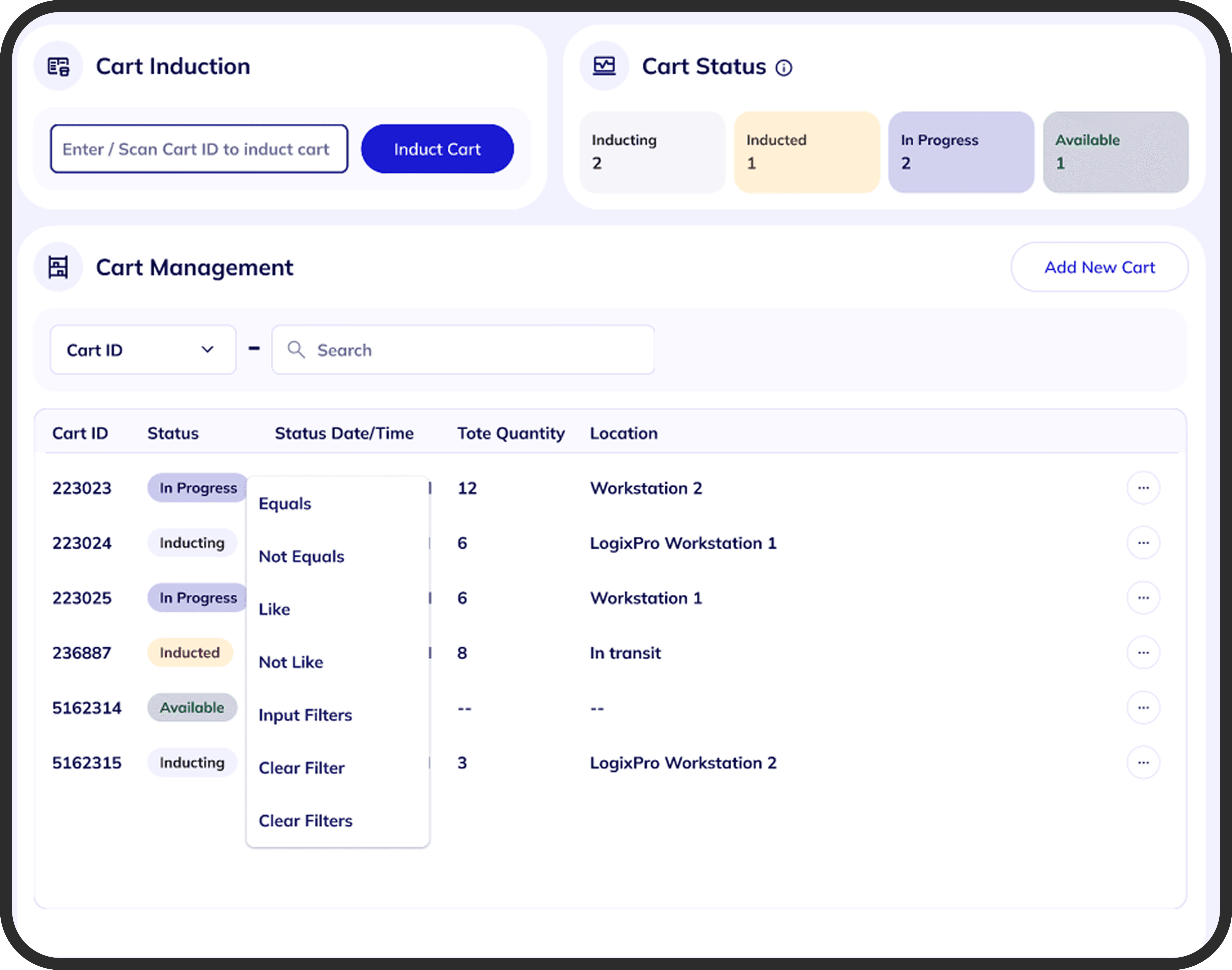
The system allowed users to filter table data through a right-click action. But nothing in the interface indicated the feature was there — and nothing showed what had happened after a filter was applied.
In data-heavy workflows where users depend on accuracy and control, invisible state creates real confusion. Filtered results appeared without any explanation, making the system feel unpredictable.
- No indication that right-click filtering existed
- No visibility into which filters were currently active
- No way to review, edit, or clear applied filters
- No system feedback — results changed without explanation
Problem statement
Users could filter table data using right-click — but there was no indication the feature existed, no visibility into which filters were active, and no way to review or remove them. Filtered results appeared without explanation.
03 — Context & Constraints
Context & Constraints
This wasn't a greenfield problem. The solution had to work within a system already in production, used across multiple modules with established patterns.
- The product was built on Angular — any solution had to fit within that ecosystem
- A strict design system was in place with limited room for new patterns
- Tables were dense and used across many modules — changes had to scale
- Performance was a concern; tables already handled heavy data rendering
- Any layout changes had to avoid breaking existing table structures
I had to solve for clarity without adding meaningful cost to the system — technically or visually.
04 — Exploration
Exploration
The exploration moved through two distinct directions before landing on the final approach. Each revealed something — either about user needs, technical limits, or both.
Direction 01 — Chip-Based Filters
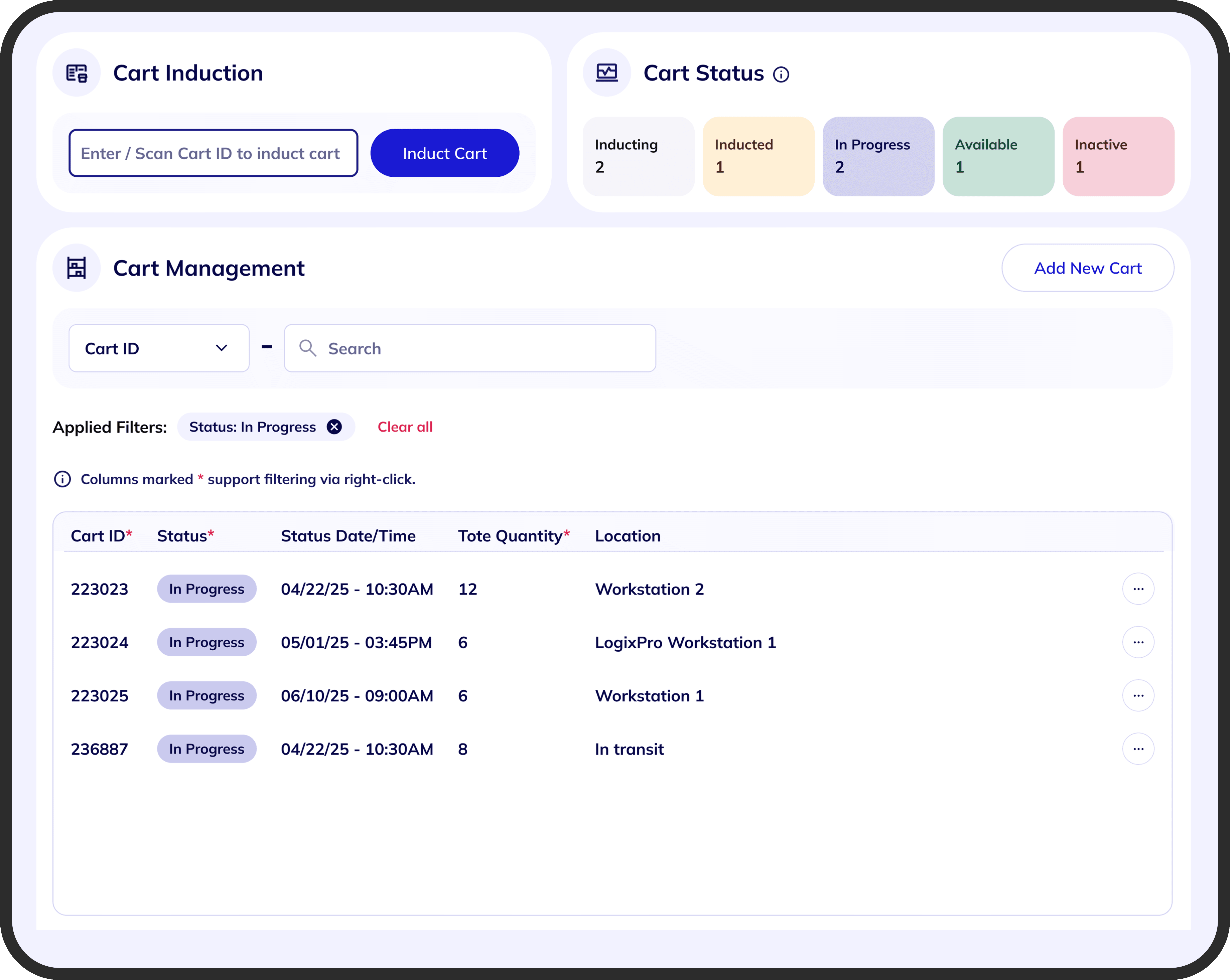
The first approach was to surface applied filters as chips above the table. This pattern is widely understood: it makes filter logic explicit, is easy to scan at a glance, and handles multiple filters without cluttering the layout.
The design showed active filters as chips — each displaying the column, condition, and value — with horizontal scrolling for multiple filters and a single “Clear All” action to reset.
Constraint Hit — Performance
During review, the development team raised a concern: rendering dynamic chips alongside already-heavy tables would add meaningful performance overhead. Scaling this across modules made the risk harder to ignore.
The chip approach couldn't move forward as designed. I needed to find something that preserved clarity without the rendering cost.
Direction 02 — Funnel Icon
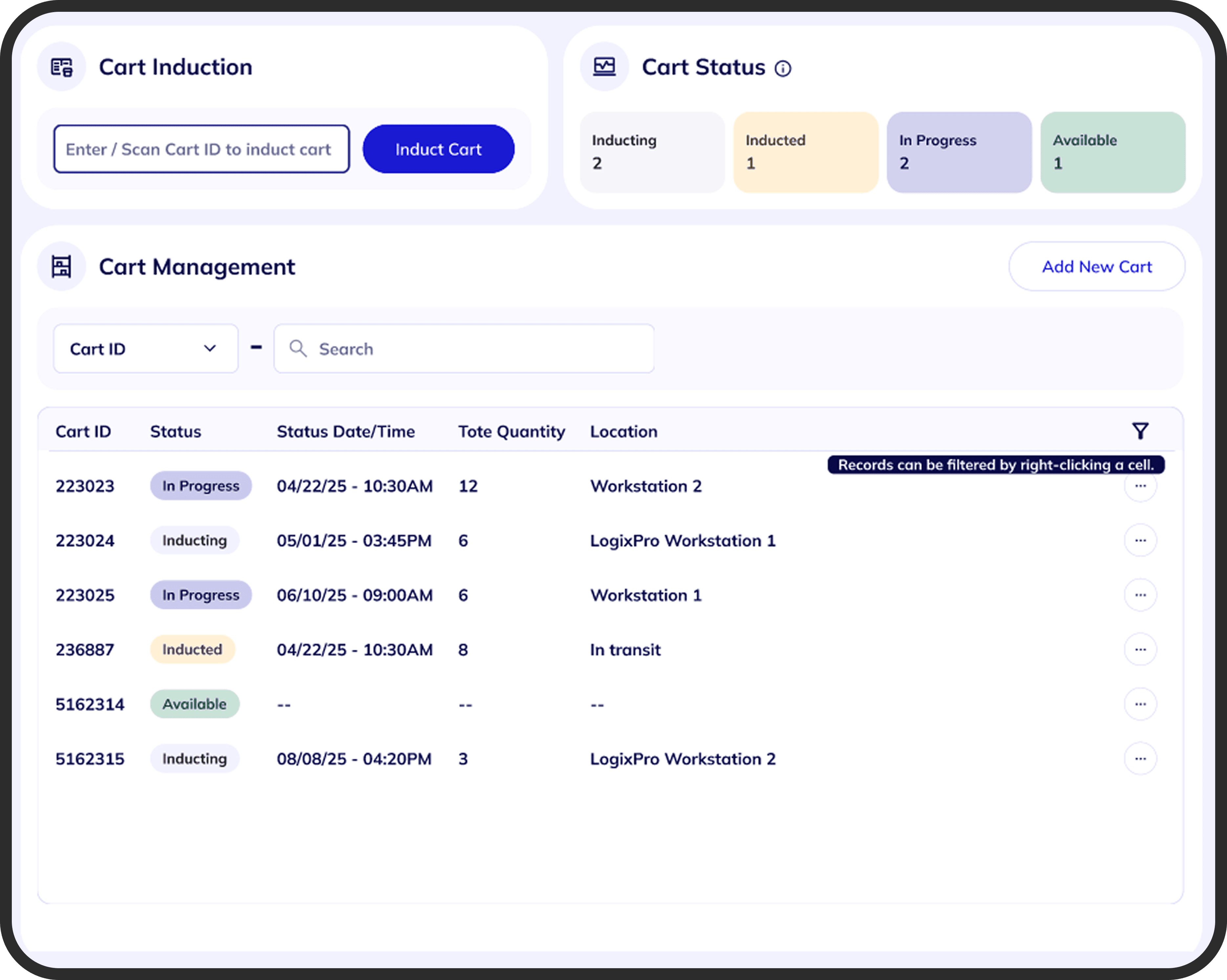
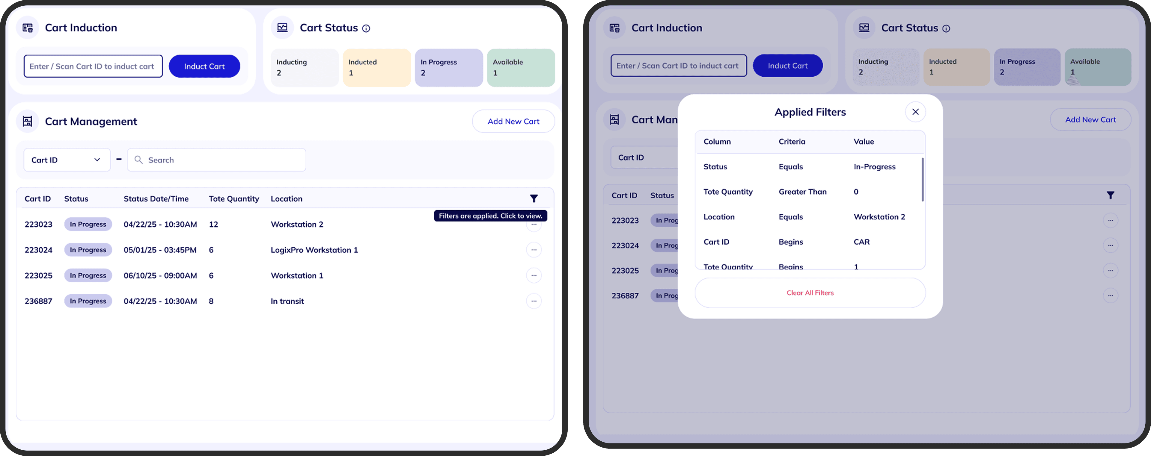
To reduce both UI and technical overhead, I explored a lighter alternative: a funnel icon placed in the table header. It required minimal layout changes, aligned with the existing design system, and was straightforward to implement.
I designed three states — default, hover (with a tooltip explaining right-click filtering), and active (showing applied filters in a small popup). Technically viable. But it introduced a new problem: it improved discoverability slightly, without making filters easy to understand at a glance.
Client Review
Both directions were presented alongside a text-plus-actions variant. Given the options, the client preferred chips — because they were the easiest to read and understand, even for users unfamiliar with the feature.
The funnel icon was technically lighter, but chips made the state immediately readable. Clarity won.
This validated the original direction. The question became: could chips be made to work within the performance constraints?
05 — Final Solution
Final Solution
Instead of abandoning chips, I reworked them to fit within the constraints. The goal was to reduce rendering overhead without sacrificing the clarity that made chips the preferred option.
Key changes
- Simplified chip structure to reduce rendering cost
- Improved visual hierarchy between column, condition, and value
- Tightened spacing to keep the layout compact across dense tables
- Optimized scrolling behavior for multiple active filters
- Minimized dynamic updates to avoid unnecessary re-renders
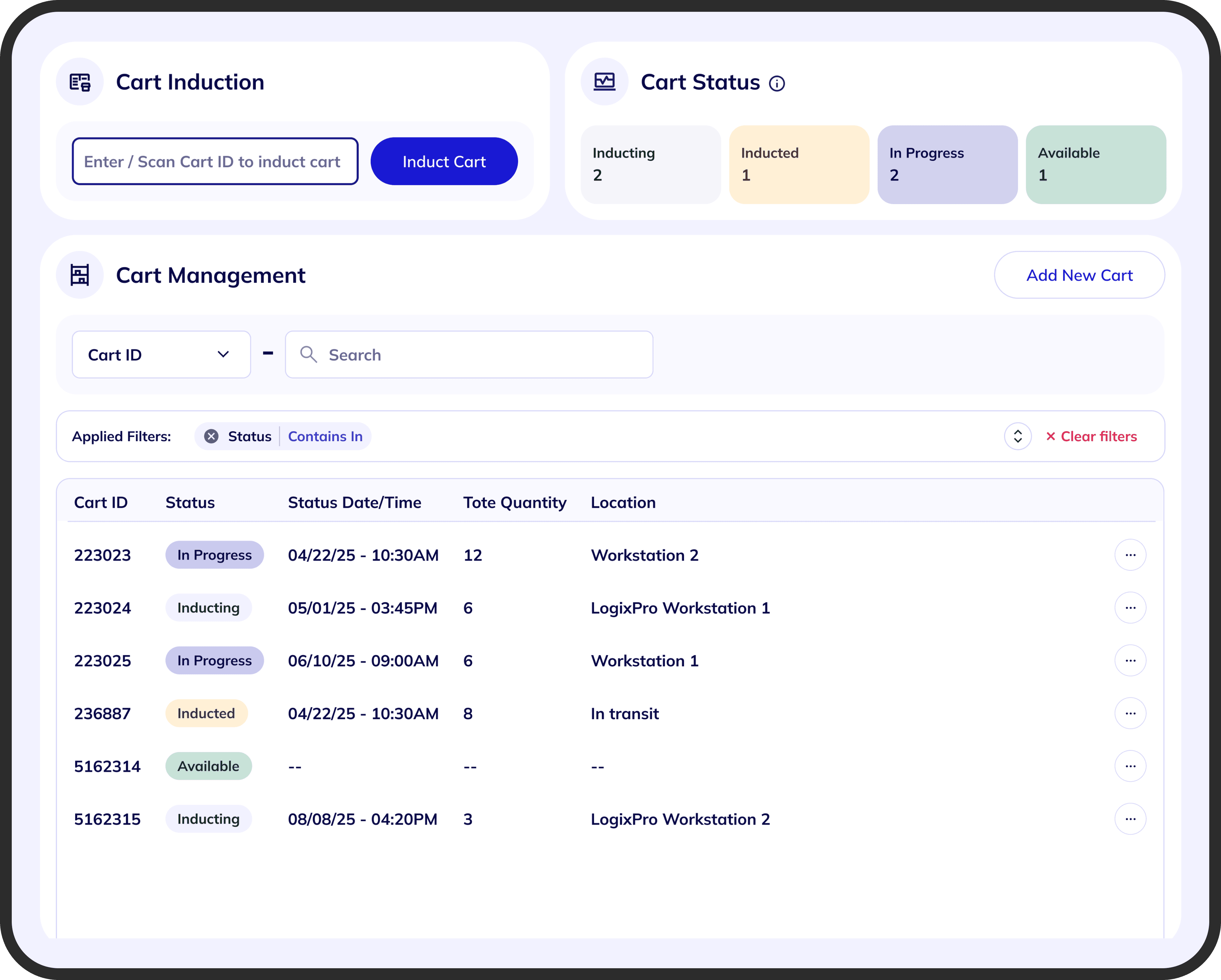
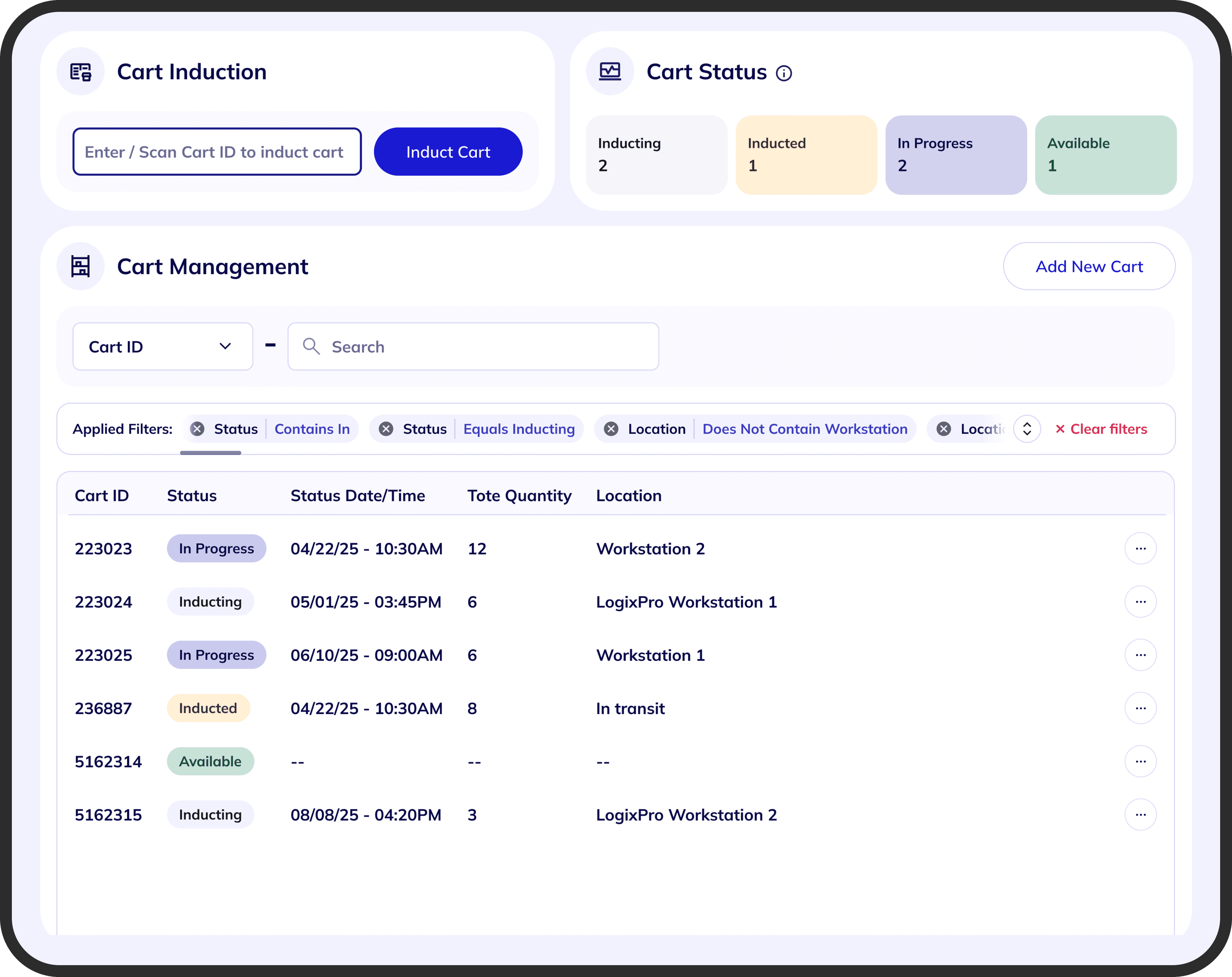
The result balanced three things that had been in tension throughout the project: clarity for the user, feasibility for the team, and consistency with the design system.
Shipped experience
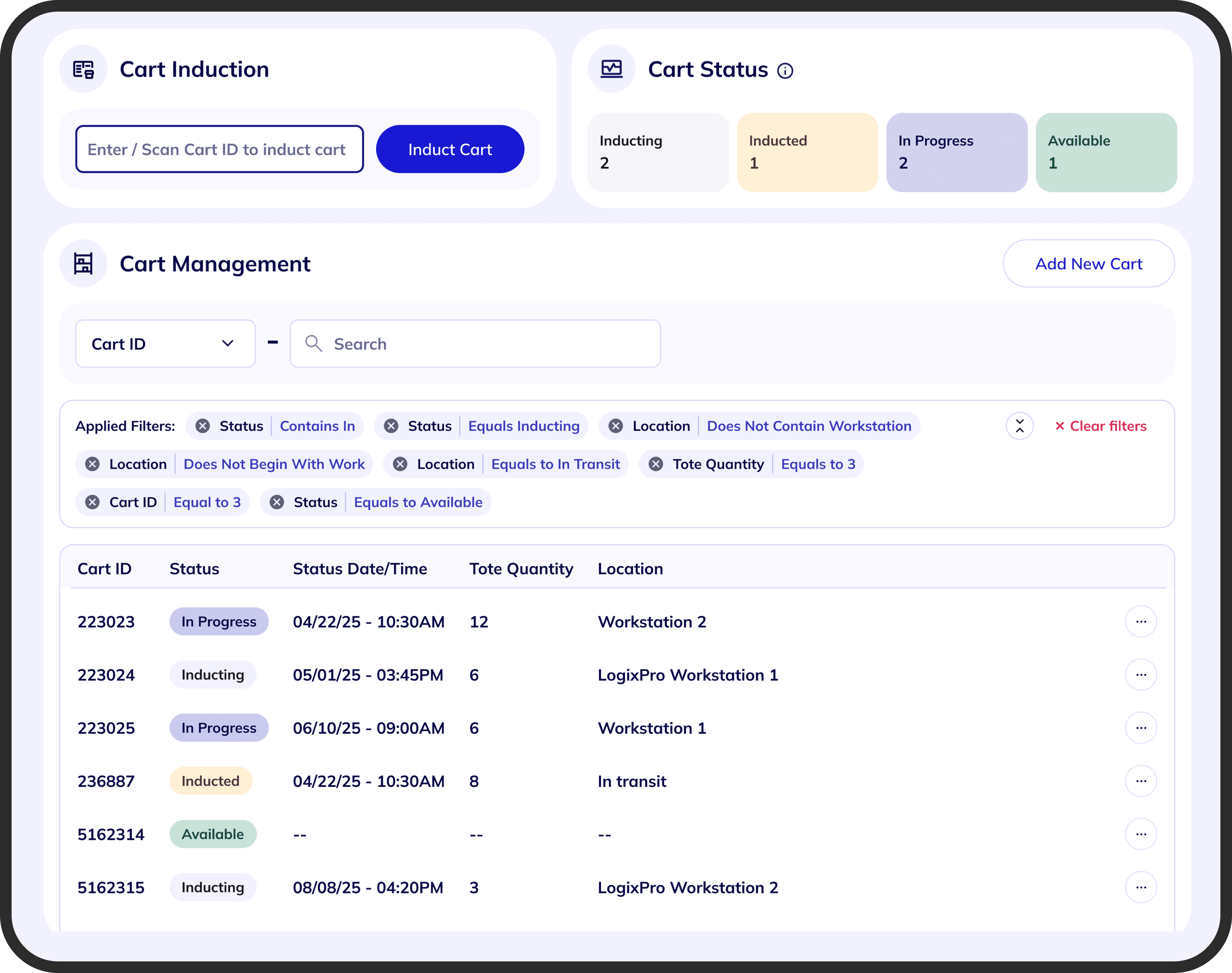
The final state makes the filtering feature visible, shows which filters are active, and gives users a direct way to review and remove them — without adding layout overhead or breaking existing table patterns.
06 — Outcome
Outcome
The solution made an existing feature usable. Users no longer had to guess whether a filter was applied — the system communicated its state clearly.
- Improved discoverability of an existing but hidden feature
- Reduced confusion in filtered data states across the platform
- Better alignment between user expectations and system behavior
- A scalable pattern reusable across all table-based modules
- Shipped within Angular and performance constraints without layout changes
07 — Reflection
Reflection
This project wasn't about adding a new feature — it was about fixing something that already existed but wasn't usable. That distinction shaped every decision.
The most useful thing I did wasn't finding the right visual pattern. It was staying in the tension between three things that kept pulling in different directions: what users needed, what the system could support, and what could scale.
The final solution came from iterating across all three constraints simultaneously — not resolving one at the expense of the others.
Chips weren't the easiest answer technically. But they were the right one for users. Making them work within the constraints — rather than replacing them with something simpler — was the real design challenge.